Design for Managing Pain Medication
Goals
Overview
A project that started when I was a CCA student, Goals is a healthcare app that aims to prevent addictions in people that have been prescribed opioids.
I also wanted to use this project as a way to use Google's Material Design.
My Role
The project started as a 2 person UX research project for a design for healthcare class and I chose to continue the design and iteration after the project was over, as it's a topic I'm passionate about.
Duration: 2 months
Design for Healthcare
UX Design
Behavior Change
Contribution
Secondary Research
User Interviews
Low Fidelity Prototypes
User Testing
High Fidelity Prototypes
Team
Hridae Walia (Me) - Interaction Designer & Researcher
Grace Dai - Researcher
Deliverables
Primary & Secondary Research
High Fidelity Wireframes
Tools
Figma
Foundational Research
Understanding the History
In the 1990s, there was a massive marketing blitz from pharmaceutical companies for their new opioid pills.
This coincided with a nationwide push to take patient pain more seriously. Early marketing materials from pharmaceutical companies made reassurances about their product, claiming their opioid pills were virtually non-addictive.
However, heroin is one of the most addictive drugs on the planet and prescription opioids are chemically similar to heroin.
Opioid Addiction causes 1 in 5 young adult deaths in the USA
Total economic burden of $78.5B per year
75% of people who became addicted to opioids in the 2000s started with prescriptions
Affected Population
People between the age of 16-28 are currently being affected the most.
Existing Treatments
Standard Treatments
Medicine Counseling/behavioral therapy
Medication-assisted therapy MAT (considered most effective)
Residential/hospital based treatment
New Treatments
Psychedelic Therapy
Ibogaine
Neurological pain treatments
Radio waves
Neuro-Stim System Bridge (a device that sends electrical impulses to the brain)

Neuro-Stim System Bridge
Interviews
Secondary research gave us a good understanding of the problem space and informed us as we went into primary research and interviews. We interviewed 3 people who had past experience with Opioid addiction and inquired about their personal history and journeys.
A1, 22yo
Recovering from opioid addiction
“Most people don’t have any idea that you are addicted to opioids. I was functioning completely normally when I was addicted, I was happy.”
A2, 30yo
Recovering from opioid addiction & currently working as an addiction counselor
“Addiction doesn’t happen overnight, neither does recovery. Someone can try heroin or opioids, the first time they can be like “this is it?””
A3, 30yo
Recovering from opioid addiction
“You need to be brutally honest to yourself. When it comes to addiction, everything is a lie - all half truths.”
Journey Mapping
Based on our interviews we created a journey map to understand the different points in the journey of people who had experienced opioid addiction. One significant trend was being prescribed opioids, which served as a trigger for further addiction.

Synthesis
Insight #1
Certain people can be more prone to addiction than others due to biological and environmental factors
Opportunity
How might we detect a person’s likelihood of becoming addicted before they accelerate their drug use
“It’s hard for people to know that they have an addict’s brain until you actually take something.”
A1
“You can’t really make changes unless you change your environment”
A2
“I’m a child of an alcoholic. I’ve met a million other addicts and it’s common to see a child of an alcoholic turn into one themselves.”
A3
Insight #2
Addiction can be completely invisible to a user and those around them, often until they can’t continue their use anymore.
Opportunity
How might we help people see their current level of dependency on drugs?
“Most people don’t have any idea that you are addicted to opioids. It was really the money that was the problem.”
A1
“Addiction doesn’t happen overnight, neither does recovery. ”
A2
“One day I didn’t have them and I started going through withdrawals. I had no idea that could even happen.”
A3
Insight #3
Addiction is not a choice. Anyone can fall victim to their environment.
Opportunity
How might we instill a general sense of caution about opioid use to inform people in their decisions?
“Most people think addiction is a choice. The first time is a choice. I stopped using, but I’ll be an addict for all my life.”
A1
“Addiction is not a choice, it’s a result of a response to your environment.”
A2
“They don’t know that once you’re in the cycle it’s impossible to stop. You need an intervention, usually that’s jail.”
A3
Ideation
How might we guide people through the prescription period to avoid opioid addiction and allow for an easier recovery
Keys to a Successful Recovery
Honesty
Structure
Social Support
Initial Concept Sketches

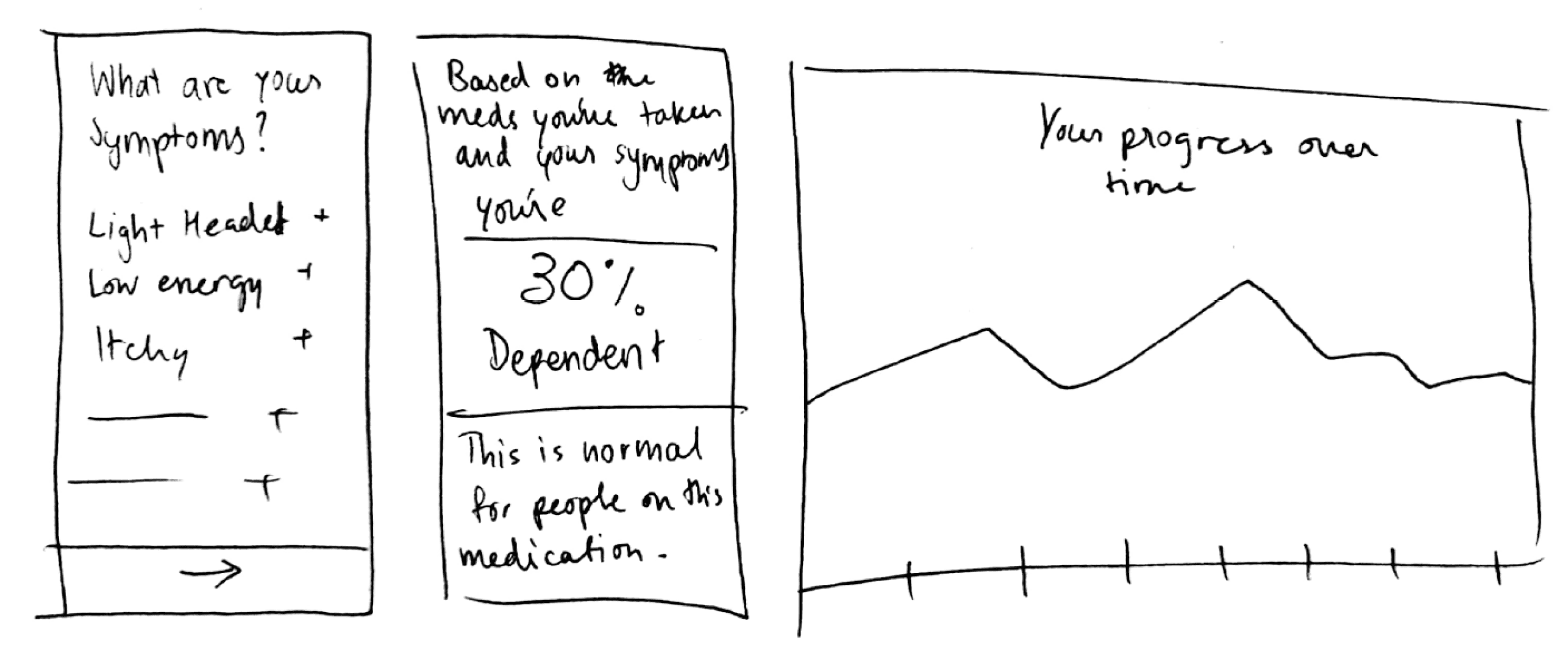
Idea 1 was a pill constraint that warned the user when they were going over their prescribed limit.

Idea 2 calculates potential addiction through usage stats so that the user knows their status.

Idea 3 uses direct input to provide dependency statistics and usage data to show progress.
Sacrificial Design Concepts
Creating 3 distinct prototypes for testing, so that I could see how people feel about the different approaches to the problem.


User Testing Concept Feedback
Pillar
“I think it's important to reiterate the idea that taking fewer pills is always better”
“It should include further breakdown of dosage within the day just so I have more information”
“Positive reinforcement would be nice to let me know when I'm doing well”
Goals
"I don't want to see my negative score, if I'm already feeling bad it's doing nothing to help"
"I like the small goals, they're not intimidating and seem easy to achieve"
"I like how simple it is but I want more information about the objectives"
Learnings
Pillar
Users want to know more about their prescribed dosage
Reward the user for accomplishing their goals
Goals
More information required
Smaller objectives are easier to approach
Dependency
Lack of confidence in the concept
Graph was a helpful visual for understanding progress
Overall Feedback
Reiterate the mission of taking fewer pills
Friendlier language
More positive reinforcement
Refined Design
Creating a refined prototype based on feedback from user testing.
"I don't want to see my score"
People did not want to see their score because it made them feel as if they were constantly doing something wrong.
"Reiterate the idea that taking fewer pills is always better"
So that people are assured that taking fewer pills is the main goal of the app
"I like the small goals, they seem easy to achieve"
Smaller goals were less intimidating and easier to follow
"I want more information about the objectives"
The objectives are easier to follow if people had an understanding and motivation to follow them
Even More Refined Design!
Another round of testing resulted in more specific feedback, the result is a more refined prototype that features stronger visual design and more detailed interaction design.
What does the floating action button do?
Make the connections between the pages more apparent
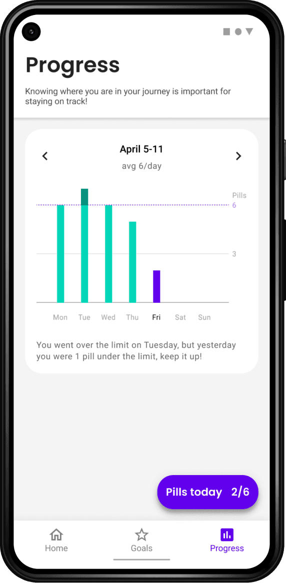
Progress page needs a more informative graph
Plan Ahead
Stay on track with a planning system that not only informs you when to take medication, but also promotes activities to help with a smoother recovery.
Goal Oriented
Track and make progress over time with the help of incremental goals that react to the amount of medication taken in a day. Goals stay more attainable to achieve higher motivation.

Reflection
Designing for Behavior Change
This was my first experience designing for behavior change and it taught me a lot about the distinct considerations, mainly the importance of positive feedback. Small design decisions can make or break the success of an experience, such as not communicating someone's progress effectively.
Updates
This was a project I started when I was a junior doing IxD at CCA but it has grown and been updated over time, because it's a topic I'm genuinely passionate about and one that people ask me about.

what are you doing here?
go look at a case study.


